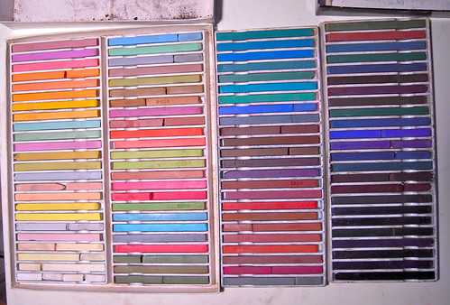
Our drawing class assignment for the weekend is to gather our art supplies to be ready to work on Monday morning. Our instructor also wanted us to arrange our nu-pastels (hard pastel sticks) in order of value and not color as they come packaged. Not so easy a task as you can see I checked mine with a black and white photo and had to do some rearranging in order to get them to 'snake' through a value scale. I'm wondering if while using them I'm going to be able to keep them organized!
Subscribe to:
Post Comments (Atom)


Hmmmm, I just typed a messsage and it disappeared. I'll try again. This is so cool to look at it. Did you squint to try to see the values or did you do it another way? When squint the turquoise blues in the second column seem to stand out as lighter. What a challenging project!
I've done my pastels in a similar way. Mine are also dark to light but also defined by hue. The reds, violets, blues, etc., are each kinda' together.
Has your brain unscrambled yet? As you said, it is not an easy task. Congrats on doing it.
Sad to say, I've spent more time arranging my pastels than using them, but I'm getting really good at matching values.
Once you start using them by value, you'll be able to return them to the proper positions or close enough.
Fascinating.
Wonderful to see the rows of color all so pleasingly arrayed. reminds me of when I was a kid and took up embroidery: I think I was attracted to the arrangement of the thread in the store.
Very interesting task! - I'm looking forward to seeing your pastel art!
Arranging by value is a good idea, since it forces you to consider that factor at least as much as hue, but I think it would drive me around the bend for a while. I'll be curious to see how you adjust to this arrangement.
This looks so much fun already Marta. I'll keep checking your blog.